Recent Posts

Showing posts with label logo history. Show all posts
Sify Technologies Limited is a major ISP company based in Chennai, India. It is a large internet network provider in India, with a wide array of internet based services. In January,  Sify Technologies unveiled a new corporate identity.

The new logo is a reflection of Sify's outlook and nature of business: a fresh, vibrant and eco-friendly green signalling a new,paper-free world, counterpoised by a business-like, dependable grey. The fonts are distinctive and futuristic. In graphic terms, the dot over the 'i' in the name has moved forward, and stands for the Company's promise to keep its customers and stakeholders ahead.

For the promise of "Keeping you ahead" reiterates Sify's focus on technology, innovation and new services aimed at keeping customers in the lead by giving them a competitive edge using Sify's services. This is probably one of the first Indian companies to take a stance on eco-friendliness. Oddly, Xerox which unveiled their new logo today also chose a lower case text for the name.

Sify Technologies Limited Logo Evolution

The 2010 Commonwealth Games are scheduled to be held in New Delhi, India between 3 October and 14 October 2010. I happened to stumble upon the logo and wanted to find the meaning behind the various elements in the logo. You can clearly see that the logo is inspired by the Chakra.
The Chakra is the national symbol of freedom, unity and power and is also found on the Indian Flag. The Chakra spiralling upwards apparently depicts the growth of India into a proud, vibrant nation. As the Chakra emerges, you can also see the the elements in the Charkra turn into people, which I suppose represents everyone involved in the games from the athletes, organizers and the host nation. The games also are going to promote a "Green" theme which may be why the Chakra ends in green. The entire logo also appears to be in the shape of a torch and flame (it may be my imagination).    

The bottom of the logo has a tagline of "Come out and play" which is an invitation to everyone to get involved and participate to the best of their abilities in the true spirit of the games. Also at the bottom of the logo, you can find a three-pointed structure which is the logo of the Commonwealth Games Foundation (CGF) also known as the Bar and the 'W'. The three points of the "W" stand for Humanity, Equality and Destiny. The CGF logo  strives to express the core values of the Commonwealth itself, which seeks to unify humanity, promote equality and give all athletes a chance to realise their destiny at the Commonwealth Games.

Overall I like the logo and it has an Indian touch to it. It may be too big with the tag line and everything else but the core logo is really pretty.

The 2010 Commonwealth Games Logo Evolution

MindTree Consulting is a IT services company from Bangalore. MindTree's logo is a very eye-catching logo due its use of vibrant colors Red, Yellow and Blue. MindTree's visual identity demonstrates the organization's DNA - Imagination, Action and Joy. The upward blue stroke signifies limitless Imagination. The red background symbolises Action, while the yellow dots are the bubbles of Joy. Our identity was designed by Chetan, a student of the Spastics Society of Karnataka. Chetan has learned not to let cerebral palsy hold back his brilliant, creative mind. At the Spastics Society of Karnataka, the MindTree team interacted with a group of ten students - many in wheel chairs, and briefed them on our Mission, Vision, and Core Values. MindTree also shared with them the three things that our visual identity should represent: Imagination, Action, and Joy.

Soon, all ten turned in their creations. Each was an original work of art. MindTree accepted all of them but decided to adopt the work of Chetan K.S., a student who has motor and speech disability. Chetan's masterful work - the blue, red and bright yellow MindTree was presented to the world on August 18, 1999. The decisive skyward, blue brush stroke is Chetan's way of communicating imagination. The red stands for action. Finally, the bright yellow bubbles represent joy.

MindTree Logo Evolution

India Post, India's Department of Post, is a government operated postal system in India; it is generally referred to within India as "the post office". The Indian Postal Service, with 155,333 post offices, is the most widely distributed post office system in the world (China is next, with 57,000). The large numbers are a result of a long tradition of many disparate postal systems which were unified in the Indian Union post-Independence. Owing to this far-flung reach and its presence in remote areas, the Indian postal service is also involved in other services such as small savings banking and financial services.

India Post unveiled a new logo in September 2008 to signify that it is all set to attune to the world class postal systems. The new logo has a rectangle in the shape of an envelope in deep red with the image of birds’ wings in bright yellow. Red symbolises the traditional association with post office, along with passion, power and commitment, while yellow communicates hope, joy and happiness. It sends the message of India Post as a dynamic organisation with modern and professional approach in its service to the common man, business and corporate clients.  India Post will very soon acquire a number of aircrafts to carry letters, parcels and logistic consignments for making overnight delivery in major towns of the country. India Post will also offer a host of new customer services to be launched very soon. These will include express parcel post retail service, gift parcel post service, logistics post air service, sale of gold coins through retail post, express money order service, speed post call centres and a range of new international services. The unveiling of the logo marks a new beginning in the journey of India Post. The new logo was built with the help of Ogilvy and Mather. 

The original logo shown alongside is relatively plain but similar to the new logo. The existing logo of India Post was designed in 1995 with the help of the Indian Institute of Technology, Bombay. The department says that the need for a change was felt because of the rapid transformation in the Indian economy and the need to create a newer and more energetic feel for India Post. A corporate logo was launched on World Post Day in 1993 (October 9, 1993), representing dynamism and actio.

India Post Logo Evolution

Dabur India Limited is a leading Indian consumer goods company with interests in  health care, Personal care and foods. Over more than a 100 years we have been dedicated to providing nature-based solutions for a healthy and holistic lifestyle. The original logo of the company was the Banyan Tree.
The new Dabur identity modernizes the 100-year old equity of the Dabur brand by subtly transforming the tree. While it retains the essence of the banyan tree, it now projects a contemporary image, in consonance with today's lifestyle. The tree, a symbol of nature, is indelibly regarded as a provider of shelter, food and protection. If you observe closely, you will see that the tree trunk mirrors the form for three people with their arms raised conveying exultation in achievement. The broad trunk represents stability and its multiple branches represent growth.

In India, the tree is a symbol of life. It is a giver of fuel, food and protection. It is a heaven for creatures it generously harbours in its foliage, as well as in the shade of its canopy. The tree is held auspicious as it spreads through the three spheres with its roots meshing through the earth, its trunk rising through the terrestrial world and its branches reaching into the heavens. The leaf is a vital part of a tree. Its functions include the manufacture of food for the plant, transpiration and respiration. A tree full of leaves represents growth, vitality, rejuvenation and renewal. I personally like the logo a lot. It takes the essence of the original logo which was the Banyan tree (very sacred in India) and transforms it into a very modern logo.


The original logo shown alongside is relatively plain. The design of the new logo must have gone through a lot of thought and with Dabur trying to expand their market globally, its a great change in my opinion.

Dabur Logo Evolution

It was 1976 and Jobs has been spending time on a friend’s farm picking apples when he told Wozniak of his idea for the name of their fledgling I.T. company. Was picking apples the inspiration? Perhaps one fell on his head and knocked free this gem of creativity, a-la Sir Issac Newton? Perhaps he just wanted to be ahead of Atari in the phone book? Whatever the case, Wozniak was equally taken with the moniker and the name stuck. All they needed then was a logo.

The first Apple Logo Design was by Ron Wayne, who also co-founded the company. It was rather elaborate in comparison to its later incarnations; as it depicted Newton under the famous apple tree, deep in contemplation. Steve Jobs felt it was a little too intellectual, and that the details were hard to distinguish. For those reasons it was only used on the Apple I.
In 1977 a second attempt at Apple logo design was undertaken by art designer Rob Janoff. The logo design was very simple- an apple with a bite taken out of it, adorned with all the colours of the rainbow, albeit in the wrong order. The symbolism here was genius; the bite symbolized knowledge, as in the Garden of Eden, and was also a play on words, as in computer “byte”. The colours suggested vibrancy and energy, but the wrong ordering of these colours suggested a break from the establishment- freedom, daring and enterprise, sentiments most befitting such a revolutionary technology. As Jean Louis Gassee put it, “You couldn’t dream of a more appropriate logo: lust, knowledge, hope and anarchy”.

The Apple logo design remained unchanged until 1997 when Steve Jobs decided to change from the multi-coloured look to a solid coloured logo design. This was simply fitting with the more minimalist fashion of the time, and perhaps to herald in a new era with the new millennium.

The only obstacle faced by the Apple Logo being cemented in popular cultures collective consciousness has been ongoing legal scuffles with Apple Records. Both founders knew when they came up with the name, that it would only be a matter of time before Apple Records voiced concern. In 1981 an agreement was reached allowing Apple Computer to use the name provided they didn’t use the name for products related to music. This peace was short lived as Apple Records sued Apple Computer in 1989 fro trademark violation, and again in 2003. The first instance was settled out of court in 1991, the most recent development remains unresolved.

The Apple logo design is at once simple and unforgettable. So effective in fact that it has remained largely unchanged for 20 years. An apple with a bite taken out of it. A universally recognised symbol of knowledge- one that remains emphatically so in this knowledge driven age.

Source: www.thelogomix.com

Apple Logo Evolution

Bharti Enterprises is one of India’s leading business groups with interests in telecom, agri business, financial services and retail. Bharti has been a pioneering force in the telecom sector with many firsts and innovations to its credit. Bharti Airtel Limited, a group company, is one of India’s leading private sector providers of telecommunications services with over 80 million customers as of end of October 2008, spanning Mobile services, Telemedia services and Enterprise services. Bharti Airtel Limited has been voted as India's most innovative company, in a survey conducted by The Wall Street Journal.

In November 2008, Bharti Enterprise unveiled a new logo. Bharti said that with the new logo, the group aims to get a facelift with fresh and youthful brand logo which reflects a multi-dimensional character that seeks out new avenues to grow. Revealing the choice of colors for the new logo, the group said that the colour Indigo blue signifies Depth and Orange stands for Youthful Passion and Energy, the Arrowheads stand for Movement that Extends over Boundaries and symbolises Swiftness, Precision and Accuracy.


The core values reflecting the new identity are empowering people, being flexible, making it happen, creating openness and transparency and creating a positive impact. In addition to the telecom and insurance businesses, Bharti has a presence now in the agricultural and food processing sectors as well.

Bharti Enterprises has unveiled its new brand identity with a new logo and a vision to become "India's finest conglomerate" by 2020. Bharti aims to achieve this by creating 'Big Transformations through Brave Actions', which is its new slogan.


The previous logo is shown alongside.

Bharti Enterprises Logo Evolution

With the UEFA Euro 2008 football tournament in full swing, I thought I would explore the
Euro 2008 logo. The 2008 UEFA European Football Championship, commonly referred to as Euro
2008, is the 13th UEFA European Football Championship, a quadrennial football tournament for
European nations. The tournament, which is being hosted by Austria and Switzerland, began on
7 June 2008 and is scheduled to conclude with the final at Ernst Happel Stadion in Vienna on
29 June 2008.


The logo has the following distinct components

Mountains - Both Austria and Switzerland are famous for their beautiful mountains. The mountains surround the soccer ball and form a large part of the logo. The mountains are in ed which is one of the primary colors in the flags of both countries. The mountains also have a nice delicate shadow as well.

Football - The football has various shades of green in it and is representative of the green mountains of the Alps.

Typography - The text on the logo has representation for the two host countries Austria and Switzerland. The red color also represents the colors of the two countries. The name of the competition Euro 2008 and the name of association that controls all football in Europe, UEFA. UEFA's logo is on the top of a circle, similar to the actual UEFA logo.
The official Euro 2008 logo was unveiled on 7 June 2005 exactly three years before the opening match. The design was created by the London-based design consultancy English &Pockett. The logo brings to mind Austria and Switzerland's common Alpine mountain sceneryand the red and white colors found in both nations' national flags

Euro 2008 Logo Evolution

ArcelorMittal is the largest steel company in the world, with 326,000 employees in more than 60 countries. The
company was formed in 2006 by the merger of Arcelor and Mittal Steel. Arcelor S.A. was the world's largest steel producer in terms of turnover and the second largest in terms of steel output. Mittal Steel Company N.V. was the world's largest steel producer by volume and also the largest in turnover. It ranks 39th on the 2008 Fortune Global 500 list. The company is headquartered in Luxembourg City, the former seat of Arcelor. 
ArcelorMittal is one of the customers my company works with and I was intrigued by the logo when I stumpled upon it. It did not seem to make much sense to me. Upon some further research and thinking, you can notice both the 'A' and the 'M' in the logo. The 'A' should be relative obvious and is actually in the form of a reverse A. If you see the logo in  the mirror, you should be able to spot the 'A' quite easily. The 'M' on the other hand is rather difficult to find. If  you look closely and look at the 2 arches, you can spot the 'M'. Much like a modern version of the McDonald's arches. At the bottom, you will find the name of company "Arcelor Mittal"  as one word.
The logo was designed by a British company called Future Brand.

This the logo of Arcelor Steel. The company was created by a merger of the former companies Aceralia (Spain), Usinor (France) and Arbed (Luxembourg) in 2002. Seems like name Arcelor comes from the parts of the three companies ARbed, ACEraLia and UsiOR, but it could just be my imagination. 
This is original logo of Mittal Steel company.

Arcelor Mittal Logo Evolution

The 2011 ICC Cricket World Cup will be the tenth Cricket World Cup, and will be hosted by three South Asian Test cricket playing countries; India, Sri Lanka and Bangladesh. It will be Bangladesh's first time co-hosting a Cricket World Cup. The World Cup will use cricket's One Day International format, with fourteen national cricket teams scheduled to compete. The World Cup will take place during the months of February and March 2011, with the first match being played on 19 February 2011.

The event has a theme called "Celebration of Cricket" and the logo represents the theme. The logo is in the shape of a cricket ball with an upright green seam and both the sides represent a crowd that is a part of the action, with the hands up, cheering and shouting for their team.

The green seam indicates the one day ball and the green of the pitch and ground. The players and crowd surround this with motion and activity. The colours and figures on each side of the ball represent the event host nations coming together along with the world of cricket. The colour and movement creates a festival, players and fans coming together from around the world to celebrate cricket in the sub-continent.

The logo was unveiled on July 14th in Mumbai and was designed by Australian creative firm Witekite, one of 12 companies from all over the world that submitted concepts. The logo, in the shape of a cricket ball, is intended to reflect all that is best about cricket in the sub-continent - colour, movement and action.

I really love the logo as it represents the energy of the crowds in the sub-continents will bring to the event. The shapes in the logo also have a very Indian touch to it.

2011 ICC Cricket World Cup Logo Evolution

Firedog is the brand name through which Circuit City stores offer in-home, in-store & online services for computer repair, installation and support, and home theater product installation.
The firedog logo is a green, black, and white logo of a dog jumping through a hoop. The logo was designed to evoke the idea of Circuit City "doing whatever it takes to get the job right". The name "Firedog" was chosen because it evokes the kind of qualities Circuit City intends their technicians and installers to provide: helpful, friendly, knowledgeable and reliable. The dog is "Man's Best Friend" and Circuit City hopes that its consumers will think that the firedog's technician are the consumers' "Best Friend".
Also, in the Chinese Callender 2006, the year Firedog was created, is the year of the Dog.

Firedog Logo Evolution

The Indian Premier League (also known as the "DLF Indian Premier League"), is a Twenty20 cricket competition created by the Board of Control for Cricket in India (BCCI) and sanctioned by the International Cricket Council. The first edition of the Indian Premier League starts on 18 April 2008. The IPL consists of 8 teams

  •  Bangalore Royal Challengers
  •  Chennai Super Kings
  •  Hyderabad Deccan Chargers
  •  Delhi DareDevils
  •  Kings XI Punjab
  •  Kolkata Knight Riders
  •  Rajasthan Royals
  •  Mumbai Indians

The IPL logo consists of three pieces
- Batsman hitting a attacking stroke to represent the game of cricket. The swish of the ball moving attempts to signify that the game is fast moving and more exciting.
- The pyramid logo of DLF Universal Limited.  DLF, is India's largest real estate developer based in New Delhi, India. DLF Universal secured exclusive rights to the Indian Premier League title sponsorship worth INR 200 crore (over US$50 million) for five years.
- The text "Indian Premier League" written in blue, probably to represent India's colours. 
Overall, I am quite disappointed in the logo. Firstly it lacks any color and originality. I think the logo could have been more colorful. Secondly, plugging in DLF's logo in the logo is a poor attempt to please the sponsor.
The logos of the partipating teams are a lot more colorful and original and the IPL logo pales in comparison even more.

The Indian Premier League Logo Evolution

The 3M logo is the key element of our corporate identity. Over the years, it has become a symbol for innovative, reliable products and services from a company people can trust. The simple 3M icon has been transformed from a mere design element into a valuable company asset.

The First 50 Years
The first 3M logo appeared in 1906. Its design was complex: The company’s full name and its headquarters (Duluth, Minn.) surrounded a diamond containing the term "3M Co."

The second phase of mark-making began in 1950 with the debut of a simplified logo. But with no standards manual to provide guidelines, variations of this logo flourished. In some cases, the oval was completely abandoned and the "3M" stood alone. A version of this logo with a laurel leaf was used to celebrate 3M's 50th anniversary.


Getting Serious About the Logo
By 1960, 3M was a major international corporation producing more than 27,000 products with sales of $550 million, and a third logo phase began. 3M hired Gerald Stahl and Associates, a New York design firm, to create a definitive logo that would unite the corporation and all of its business units under a single sign. The result was a "3M" with a decidedly industrial look.

When the new logo was announced in 1961, Joseph C. Duke, 3M executive vice president, explained its rationale in a story in Advertising Age magazine: "When one product, division or subsidiary makes a favorable impression anywhere, every other 3M division, subsidiary or product should benefit. In turn, the achievements and prestige of the 3M company should benefit each product and activity of the company."


Lots of Variations
The new logo design came with an identification system manual showing proper use of the symbol and overall graphics system. The system began with no fewer than four approved variations of the logo, and that number multiplied rapidly as divisions found the need for exceptions to the rules. This diminished the objective set forth by Duke.

Packaging was specifically excluded from the 1961 system and, thus, by 1965, 3M had many inconsistent brand and package designs. Brooks Stevens Associates, a Milwaukee, Wis., design firm, was hired to restore order. The firm’s concept called for each 3M package to have three color blocks: the first identifying the product, the second identifying the division and the third carrying the 3M logo. The system retained the logo and special typeface developed earlier by Stahl in New York.

According to the guidelines, each division was allowed to have its own distinctive symbol, but this undermined the visual continuity 3M was seeking. As the number of 3M divisions and products multiplied, so did the number of logo and packaging variations. While the goal was to create a specialized family appearance for all of the divisions’ products, the corporation didn’t have a unified look.


Recommendation for Revision
By the 1970s, a change was needed. 3M was no longer a company focused on industrial abrasives and tapes, but now had many innovative products for the commercial and consumer markets.

In 1977, 3M embarked on phase four in the evolution of the logo. Siegel & Gale (S&G), a New York design firm, was hired to audit the existing system. At the core of S&G’s recommendations was a new logo design — a very simple symbol in a modified Sans Serif typeface with the "3" and "M" touching one another. Allen Siegel, president of S&G, also pushed for a new corporate color — red. The new, vibrant logo caught on like wildfire.

The new 3M Corporate Identity and Design department guided the changeover on a case-by-case basis. The department also did something very important that had not been done when the 1961 design was introduced: It trained communications personnel around the world on how to use the new logo correctly.

Reference:http://solutions.3m.com/wps/portal/3M/en_WW/Corp/Identity/Elements/3M-Logo/History/

3M Logo Evolution

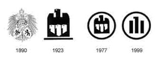
Allianz is the second largest international insurance and financial services organization in the world, headquartered in Munich, Germany.


Logo History:
The choice of the Reich eagle as Allianz’s logo, with the Munich Kindl and the Berlin Bear in the left and right bottom corners, pointed to the original and new location of the enterprise, although the specificity of these particularist elements was eliminated in 1923 when the logo was transformed to reflect at once the unity and the multiplicity of an expanded company. The new logo showed a single mother eagle encompassing three smaller eagles, and while the contours of the logo were to become “softer” and more appealing by the mid-1970s. The logo underwent a change again in the 90s with parallel 3 lines that depicted the 4 eagles.

Allianz Logo Evolution

Baskin-Robbins is a global chain of ice cream parlors founded by Burt Baskin and Irv Robbins in 1953, from the merging of their respective ice cream parlors, in Glendale, California. It claims to be the world's largest ice cream franchise, with more than 5,800 locations, 2,800 of which are located in the United States. The Baskin-Robbins ice cream parlors started as separate ventures from Burt Baskin and Irv Robbins, owning Burt's Ice Cream Shop and Snowbird Ice Cream respectively. Snowbird Ice Cream featured 21
flavors, a novel concept for the time. When the separate companies merged in 1953, this concept grew to 31 flavors. Baskin-Robbins is known for its "31 flavors" slogan.

Starting 2006, the company went through a campaign to change its brand including redesign of its stores, its website and even its logo. The current logo is clever in that it incorporates the 31 (in pink) that represents the 31 flavors, cleverly embedding it in the B R of the logo. The font was also changed from the a regular straight font to a more zig-zag font. The pink represents the pink spoon which is given when customers ask for samples (see below for more history)

The idea for having 31 flavors came from the Carson-Roberts advertising agency (which later became Ogilvy & Mather) in 1953, along with the slogan "Count the Flavors. Where flavor counts." 31 was also more than the 28 flavors then famously offered at Howard Johnson's restaurants. Burt and Irv also believed that people should be able to sample flavors until they found one they wanted to buy - hence the iconic small pink spoon. During a now famous promotion, Amy Boggioni led a group of three who finished 31 scoops of all 31 flavors in under 31 minutes.

Baskin-Robbins sells ice cream in over 30 countries, including Canada, Japan, Mexico, Bahrain, the United Kingdom, the United Arab Emirates, Egypt, Saudi Arabia, Australia, the Philippines, Thailand, Vietnam, Indonesia, Malaysia, Bangladesh, South Korea, India, Pakistan, Panama and Taiwan.
The two logos prior to the one unveiled in 2007 are show below. Details of when theh logos changed are not known to me. In the prior logos as well, one can see the emphasis on 31 and the color pink. There are only 24 dots (not 31) in the first logo, in case you were planning to count.

Baskin Robbins Logo Evolution

Starbucks Corporation is a coffeehouse chain based in the United States. Named after a character in the novel Moby Dick, it is the largest coffeehouse company in the world, with over 7500 self-operated and 5500 licensed stores in 39 countries. The current company logo, modeled after a 15th century Norse woodcut, is a mixoparthenos, or "twin-tailed mermaid, or siren as she's known in Greek mythology. The company and the logo have an interesting history.
In Jan 2011, Starbucks released a new version of the logo with a couple of big changes and some subtle changes as well. The two major changes made to the logo are
  • They removed the name of the company "Starbucks Coffee". Their intention behind this maybe to expand the brand to beyond coffee. They have been talking about expanding into breakfast and there was also talk of a Bar/Lounge concept. This makes sense if they want to expand but maybe they should have kept the name "Starbucks" and removed "Coffee".
  • They also removed the circle around the Siren and the logo now features just the Siren.
The logo has some subtle changes including smoothing her hair, refining her facial features, weighting the scales on her tail to bring the focus to her face. The logo refinements were done by Lippincott.

Starbucks was founded in Seattle, Washington, in 1971 as a local coffee bean roaster and retailer called Starbucks Coffee, Tea and Spices. Howard Schultz joined the company in 1982 and was inspired on a trip to Italy to develop a similar espresso bar and coffeehouse culture in the United States. To advance the concept, he founded the company Il Giornale three years later. In 1987, Schultz purchased Starbucks, merged it with Il Giornale, and renamed the company Starbucks Corporation. The logo on the left is that of the Il Giornale company. As you can see, the Il Giornale logo is somewhat similar to Starbucks logo i.e being circular and having a band. 
The original logo, as seen on the left, the Starbucks siren was topless and had a fully-visible double fish tail. The original logo has raised some controvery because of the bare chest, but the logo continues to appear on some of the products like the Starbucks Anniversary Blend 1 lb coffee bags. Both the original logos seem to be perfect on wooden crates.


In the second version, her chest was covered by her flowing hair, but her navel was still visible, and the fish tail was cropped slightly. The logo also inherited the stars from the Il Giornale logo.


In the current version, her navel and chest are not visible at all, and only vestiges remain of the fish tails.


Starbucks Logo Evolution

Caribou Coffee is a specialty coffee and espresso retailer, the second largest in the United States after Starbucks. Caribou sells gourmet coffees, teas, and bakery goods in 415 company-owned coffeehouses in 16 states and the District of Columbia, as well as 80 franchise locations worldwide. The founders of the company were inspired to start this company while they were in Alaska's Denali National Park and hence the name Caribou. A Caribou is a wild reindeer in North America widespread across the Arctic and Subarctic.

The new logo has the following key changes and concepts.
  1. Central to this new rebranding, the company's logo has been adapted to a simpler but playful representation of the brand's key identification. Most noticeably, the leaping caribou is now a coffee-brown color and in the brand's playful nature, is assembled out of graphic elements, including a coffee bean at the heart of the animal and "C" shaped antlers.
  2. The two legs of the Caribou are in the shape of spoons that are used to measure coffee
  3. The caribou also now leaps to the right, signifying the company's vision and movement toward the future.
  4. The blue shield at the back represents the signage from Alaska's Denali park and was also present in the old logo. 
  5. The "Cariobou Coffee" font is also more contemporaryand easy to read.
The new brand look includes a new logo, color palette and design elements that bring fresh energy and broader context to the existing tagline: Life is short. Stay awake for it.
Overall I like the new logo. Its more creative and also has some nice intelligent concepts in it too..
The original logo of Caribou Coffee is shown above. The original logo had the caribou leaping left and the blue signage as in the new logo.

The picture on the left is that of a Carbou and you can see how the logo looks like the animal

Caribou Coffee Logo Evolution

The 3-Stripes mark is without doubt the quintessential adidas symbol. It was created by the adidas company founder, Adi Dassler, and first used on footwear in 1949. Dassler created a symbol that could be immediately recognized when his footwear was used in athletic competition and associated with adidas. He emphasized the association with the slogan “The Brand with the 3 Stripes”. The 3- Stripes were first used on apparel in 1967. The 3-Stripes now enjoy worldwide recognition as an adidas symbol.

adidas expanded into the leisure and apparel sector, and this prompted Käthe and Adi Dassler to seek a new, additional identification mark for the adidas brand in the late 1960s. In August 1971, the Trefoil was born, out of more than 100 ideas.Inspired by the 3-Stripes, it is a geometric execution with a triple intersection, symbolizing the diversity of the adidas brand. This symbol was first used on adidas
products in 1972, and later became the company’s corporate symbol. Today it plays the important role of representing the adidas Sport Heritage division.

In 1997, adidas decided to introduce an integrated corporate design, choosing as the core element a new and yet familiar old logo: the 3 bars. It was designed in 1990 by the then Creative Director Peter Moore, and initially used on the Equipment range of performance products. It is inspired by the 3-Stripes as they appear on footwear. The shape formed by the bars also represents a mountain,indicating the challenge to be faced and the goals to be achieved.

In August 1998, following the merger of adidas and Salomon, adidas-Salomon AG introduced a new corporate logo. The logo unites the values of the brands of the new Group, incorporating the typical colours of the two previous groups: blue for adidas, red for Salomon. The logo shows three shapes coming together to form a larger shape, namely a diamond. The space between the shapes forms another shape, that of a person with arms raised in victory and celebration. This logo, which was also designed by Peter Moore, appears on all corporate documents of
adidas-Salomon AG, but not on products. All the brands belonging to the adidas- Salomon Group, i.e. adidas, Salomon, TaylorMade, Mavic, Bonfire, Arc’Teryx, Cliché and Maxfli retain their full logo identity on products, in marketing and in communication.

In July 2002, adidas-Salomon AG presented a revolutionary new business strategy for the adidas brand, aimed at expanding its customer base and driving top-line growth. The new structure is a fundamental shift from the traditional “Footwear” and “Apparel” structure, introducing a new three-divisional approach with the “Sport Performance”, “Sport Heritage” and “Sport Style” divisions.

The products in the adidas Sport Performance division are developed for the sports performance market but have design appeal, encouraging consumers to wear the products both on and off the court or playing field.

The adidas Sport Heritage division contains adidas Originals products. Originals products seek to extend the adidas brand’s unique and authentic heritage to the lifestyle market. Design and functionality are already strong aspects of the two existing adidas divisions and will be continued with an even stronger focus in the new Sport Style division.

adidas Sport Style - the future in sportswear and designed by Yohji Yamamoto is an exclusive collection, consisting of men’s and women’s footwear, apparel and accessories. It combines the mission of the sports brand with the vision of style to develop an unexpected and radical appeal. Yohji Yamamoto: “For me, this is an interesting and exciting new project on many levels. And, I always wanted my clothes to be accessible to… and desired by… a greater number of people, and I feel that it will be possible for me to achieve this through this new line.”

The adidas Sport Style logo was created in 2001. The inspiration for the symbol was the fast moving and ever-changing world we live in today. This is also the inspiration for the whole concept behind the Sport Style Division. The world is represented with the globe whose speed is captured by the oval shape. adidas is indicated by the three stripes across the face of the globe, keeping pace with the speed and change of our world.

 The corporate logo of the adidas Group changes after the divestiture of Salomon in October 2005. The new logo is known by many: The famous “adidas wordmark” has been in use since the 1960s and has seen various forms. Today it again represents the adidas Group and differentiates the parts of the brand from the business. From a design perspective, the new logo is simple, clear, confident and shows leadership. It will support future business growth and is flexible enough to anticipate any unforeseen changes.

Reference:http://www.adidas-group.com/en/overview/history/logoHistory-e.pdf

Adidas Logo Evolution

In 1971 company founder Phil Knight was supplementing his modest income from his fledgling Blue Ribbon Sports, Inc., by teaching an accounting class at Portland State University. There he met Carolyn Davidson, a graphic design student, who was working on a drawing assignment in the hallway. Knight offered to pay her a couple of bucks an hour if she would do some design work for his small company.

"Representatives from Japan were coming for a presentation and Phil wanted some charts and graphs to show them," recalls Davidson. "I did some design work for him, and then one day he asked me if I wanted to work on a shoe stripe. He said he needed more inventory control."

According to Davidson, Knight wanted a design that suggested movement. She let flow the creative juices and came back to him with numerous designs. None captivated his imagination.

However, Knight was staring down a deadline. Shoe boxes in Mexico were waiting to be printed. He needed a logo. He needed a decision. So he grabbed her rendering of the Swoosh, telling Davidson, "I don't love it, but it will grow on me."

Being fresh out of school with a design degree, and hungry for work, Davidson submitted her bill for $35 for the Swoosh design. She continued to design for the newly renamed company Nike, including ads, brochures, posters and catalogues. The company's growth was exponential, and there came a point when her one-person design shop was too small to handle Nike's advertising needs. Nike and Davidson agreed it was time for a full-service ad agency.

But the Swoosh creator didn't just ride off into the sunset. Davidson got a telephone call one day in September 1983, inviting her to have lunch and touch base again with a few of the people she used to work with at Nike, including Knight. When she arrived, much to her surprise, she was greeted with a catered lunch and was presented with a gold Swoosh ring embedded with a diamond. She also received a certificate from Knight and an envelope containing Nike stock.

How much stock remains a secret between Knight and her. "The stock has split three times since I received it, so I can definitely say that I have been well compensated for my design," she says. "You must remember too, that this was something rather special for Phil to do, because I originally billed him and he paid that invoice."

Davidson still lives in Portland, Oregon. She's married, the mother of two grown sons and a proud grandmother. She retired from graphic design after 29 years and is now pursuing varied interests and doing the volunteer work that she couldn't do while running her one-woman business and raising her family. One day a week you will find her at one of her favorite places to volunteer, the Ronald McDonald House at Emanuel Hospital.

And we're fairly certain that the Swoosh grew on Phil.

Reference: http://www.nike.com/nikebiz/nikebiz.jhtml?page=5&item=origin

Nike Logo Evolution

The North Face, Inc. is an outdoor product company specializing in high-end outerwear, fleece, footwear, and equipment. The clothing and equipment lines are catered towards climbers, mountaineers, skiers, snowboarders, hikers, and endurance athletes.The clothing line is famous for its use on mountaineering expeditions on Mt. Everest and in other extreme outdoor activities.

The North Face brand was established in 1968, in San Francisco, California, when Douglas Tompkins and Kenneth "Hap" Klopp created an equipment retail store that eventually acquired the current name "The North Face". This name was chosen because the north face of a mountain in the northern hemisphere is generally the steepest, coldest, and most difficult face to climb.

The North Face's easily recognizable logo consists of a slightly skewed quarter-circle with two lines running within it. This image is supposedly an interpretation of the famous Half Dome rock formation in Yosemite National Park. Adjacent to the symbol are the words THE NORTH FACE embroidered in large block letters.


North Face Logo Evolution

logo history

Brand History

logo pictures